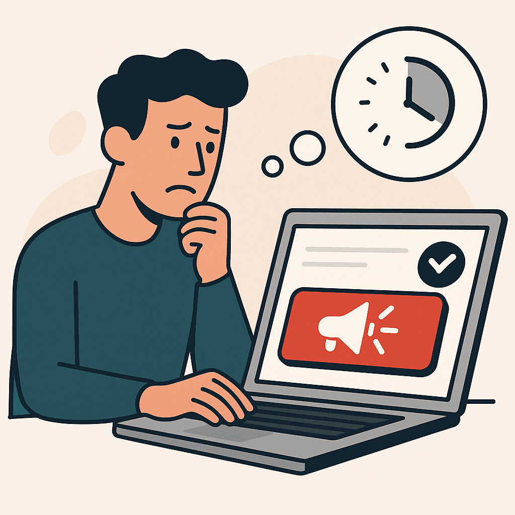
Your CTA is visible. Your form is above the fold. The button copy is clear. Everything looks optimized, and yet people don't click. Or they click, start the form, and abandon it halfway through.
The typical response is to make the CTA louder. Brighter button. Bigger text. More urgency. But when commitment timing errors are the problem, pushing harder makes things worse. The issue isn't that visitors can't see the ask. It's that the ask is coming before they're ready to answer it.
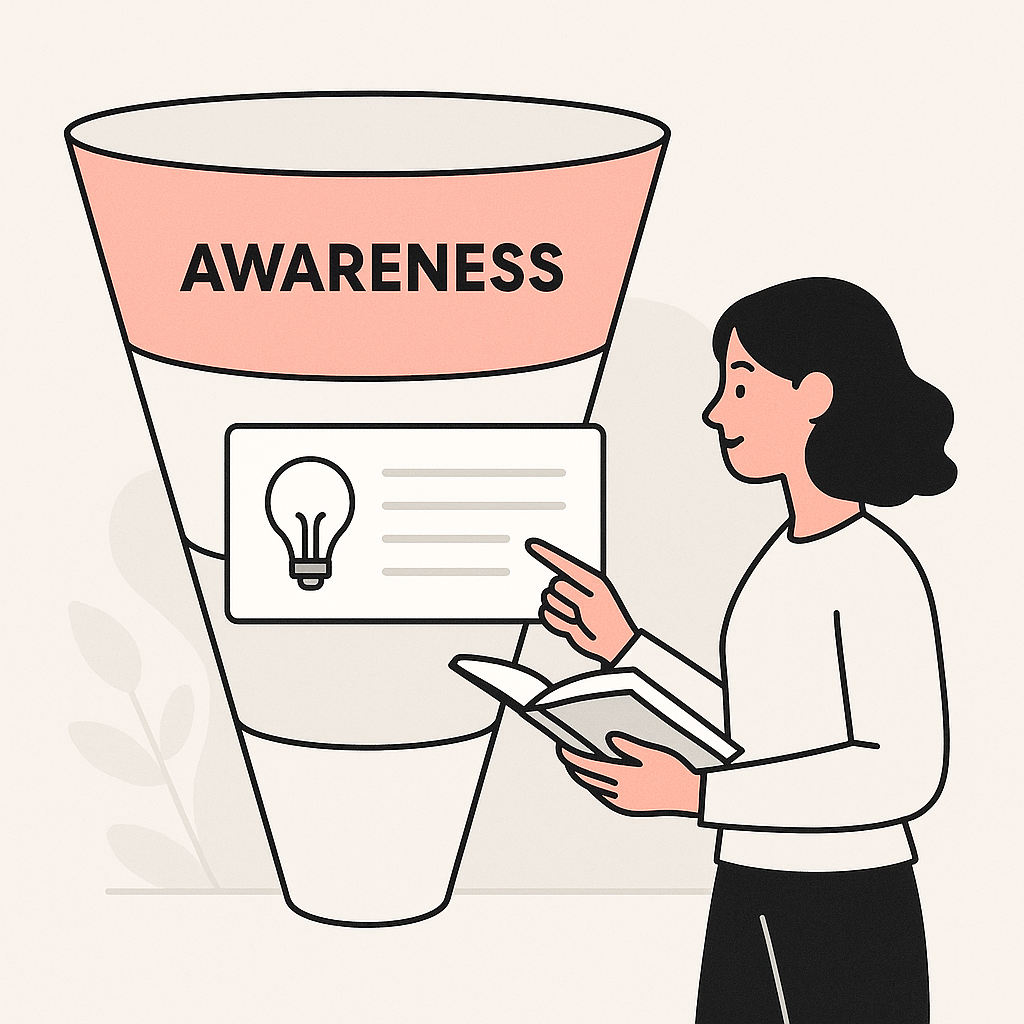
This is one of the four reasons websites get traffic but no leads, and it's tricky because the page looks fine. The problem is invisible until you think about where the visitor actually is in their decision.
The False Fix: Making the CTA Louder
When conversions are low, the instinct is to optimize the CTA. Move it higher. Make it stand out more. Add a countdown timer. Create urgency.
But these fixes assume the visitor is ready and just needs a nudge. If they're not ready, the nudge becomes pressure, and pressure creates resistance, not action. The visitor wasn't stuck because the button was hard to find. They were stuck because the ask didn't match their stage.
A visible CTA isn't the same as a correctly timed CTA. Visibility gets attention. Timing gets action. When the ask comes before the visitor has reached a decision, even the best-designed CTA will underperform.
A CTA Is a Commitment Request (Not a Decoration)

Every CTA is asking the visitor to spend something: time, attention, information, money, or identity. "Book a demo" costs 30 minutes and requires talking to a stranger. "Start free trial" costs an email and the risk of being sold to. "Contact us" costs vulnerability and the possibility of rejection.
These aren't small asks. They require the visitor to have already decided something. If they haven't, if they're still figuring out whether this is relevant, whether it's credible, whether it fits their situation, then the ask is premature.
Visitors delay commitments when uncertainty is still high. Not because they're uninterested, but because they haven't finished deciding. The CTA is asking for a conclusion before the reasoning is complete.
The Four Timing Errors That Kill Conversions

Commitment timing fails in predictable ways. Each error has a different root cause, and a different fix.
Error 1: Asking Before Relevance Is Clear
The visitor lands on the page and immediately sees a form or CTA. But they haven't yet figured out whether this is for them. They're still in "is this relevant?" mode, and you're already asking for commitment.
This happens often with aggressive above-the-fold CTAs. The button is visible, but the visitor hasn't scrolled far enough to understand what they'd be committing to. They leave, not because the offer is bad, but because they couldn't evaluate it yet.
The fix: Establish relevance before asking for anything. The visitor should know who this is for and what problem it solves before they see the CTA.
Error 2: Asking Before Proof Exists
The visitor understands what you're offering. They're interested. But they haven't seen enough evidence to believe it works. The CTA asks them to take a leap of faith they're not willing to take.
This is common on pages that pitch hard but prove little. Lots of claim, not much evidence. The visitor wants to believe you. They just don't have enough reason to yet.
The fix: Sequence proof before the ask. Show specific results, relevant examples, or credible constraints before you ask for commitment.
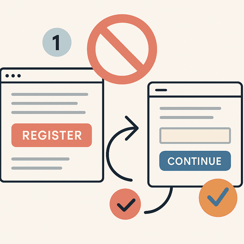
Error 3: Asking for the Final Step Too Early
Some pages only offer one CTA: the big commitment. "Book a demo." "Start your trial." "Contact sales." But the visitor isn't ready for the final step. They're still deciding whether to explore.
When the only option is the big ask, visitors who aren't ready have no path forward. They leave, intending to come back later. Most don't.
The fix: Offer a smaller step for visitors who aren't ready for the big one. "See how it works" is smaller than "Book a demo." "Download the guide" is smaller than "Start your trial." Give them a way to move forward without committing fully.
Error 4: No Safe Next Step
Even when visitors are ready to act, they can hesitate if the next step feels risky. Long forms. Aggressive follow-up. No way to undo. No clarity on what happens next.
This isn't about the commitment being wrong. It's about the experience of committing feeling unsafe. The ask is fine; the execution creates friction.
The fix: Reduce perceived risk. Shorter forms. Clear expectations ("We'll email you a link, no call required"). Visible reversibility ("Cancel anytime"). The safer the step feels, the easier it is to take.
What to Do Instead: Sequence the Commitments

The fix for timing errors isn't to remove CTAs. It's to sequence them correctly. The page should guide the visitor through a progression: clarity, then proof, then a safe step, then the full ask.
Think of it as earning the right to ask. Before you can request a demo, you need to prove relevance. Before you can ask for contact info, you need to prove value. Before you can ask for purchase, you need to prove fit and reduce risk.
This doesn't mean burying your CTA at the bottom. It means making sure the visitor has the information they need before they reach it. The best-converting pages feel like natural progressions, not pressure sequences.
Getting Started: Replace One Premature Ask With One Safe Step
Fix one timing error
- Pick one page with CTA underperformance. High traffic, visible CTA, low clicks or high abandonment.
- Identify the current ask. What commitment is the CTA requesting?
- Check what comes before the ask. Has the page established relevance? Proof? Fit?
- Identify the timing gap. What's missing before the ask makes sense?
- Add a smaller step if needed. For visitors who aren't ready, offer a lower-commitment option.
- Reduce friction on the ask itself. Shorter form? Clearer expectations? Visible reversibility?