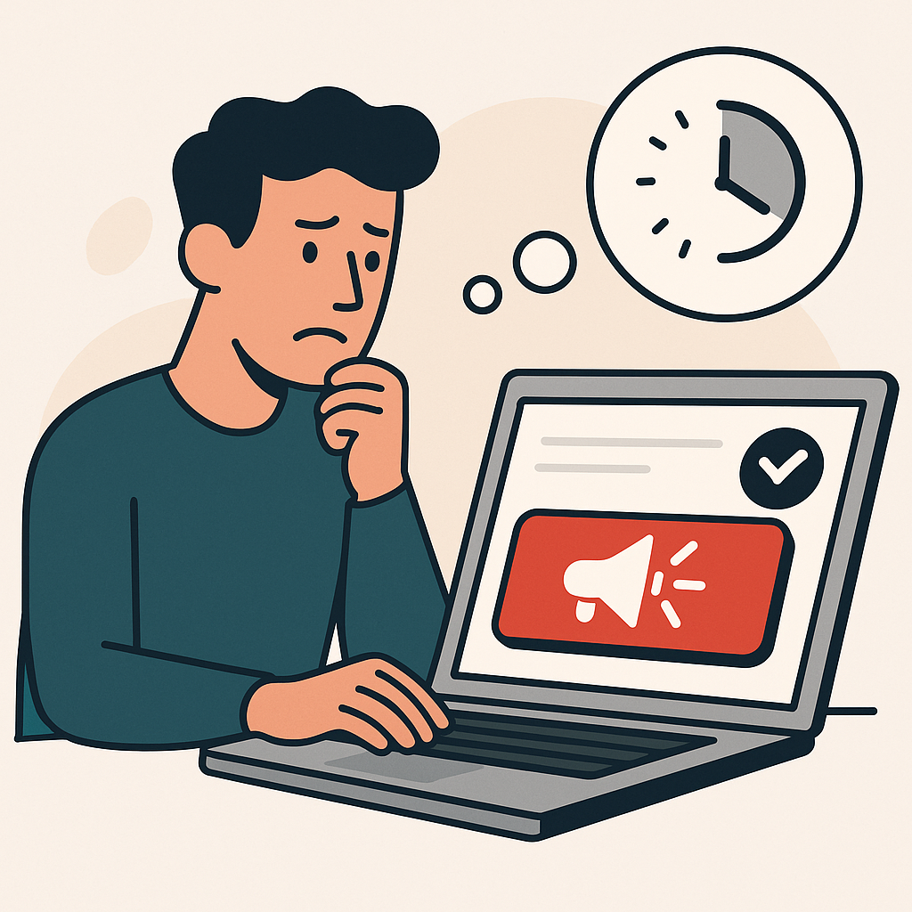
Your service page isn't converting. People find it. They read it. They scroll all the way to the bottom. Some of them come back two or three times. But they don't fill out the form. They don't book the call. They don't take the next step.
The offer feels solid. The traffic seems right. Stakeholders push for harder CTAs, louder urgency, more proof. But the page keeps growing and still nothing converts.
The issue isn't persuasion. It's readiness. The visitor hasn't reached a decision they feel good about, and the page is asking for commitment anyway. This is one of the core page-role failures that explains why websites get traffic but no leads.
The Stall: Interest Without Commitment

Service pages attract interested visitors. That's the good news. They click because they have a problem you might solve. They read because they want to know more.
But interest isn't the same as action. A visitor can want what you're offering and still not be ready to commit. They're weighing options. They're not sure it fits. They're uncertain about what happens next. And when that uncertainty is unresolved, they delay.
The page stalls because it assumes the visitor has already decided. It jumps to the ask without helping them finish the decision. They leave, not rejecting, just deferring.
What a Product/Service Page Is Actually Responsible For

A service page has one job: help the visitor decide whether this fits, and if so, what to do next. That means answering three questions in order:
- Is this for me? Does this page understand my situation?
- Is it real? Does this actually work, and can I believe it?
- What happens next? Is the next step clear, and is it safe?
When a page skips steps, or answers them weakly, visitors stall. They're not refusing. They're stuck on a question the page didn't answer.
The 4 Reasons Core Pages Stall
Failure 1: Fit Isn't Obvious
The visitor can't tell whether this is for them. The language is vague. The examples are generic. The page could apply to anyone, which means it doesn't feel like it applies to them specifically.
This creates hesitation early. If the visitor isn't sure the service fits their situation, they won't keep reading with conviction. They'll skim, wonder, and eventually leave to find something that feels more relevant.
The fix: Be specific about who this is for. Name the problem. Describe the situation. Use constraints that help visitors self-select. "This is for X" is more persuasive than "This is for everyone."
Failure 2: Proof Doesn't Match the Decision
The page has testimonials, logos, and numbers. But the proof doesn't answer the visitor's actual doubt.
A visitor wondering "will this work for my situation?" doesn't need to see that it worked for a Fortune 500 company. They need to see that it worked for someone like them. Proof that doesn't match the decision stage is noise, not signal. The key is that trust is gradual, and each stage needs different evidence.
The fix: Choose proof that matches the question the visitor is asking. For relevance doubts, show scenarios. For credibility doubts, show results. For fit doubts, show edge cases or constraints. One relevant proof beat is worth ten irrelevant ones.
Failure 3: The Ask Comes Too Early
The visitor scrolls to the CTA and freezes. "Book a call." "Get started." "Request a quote." The ask feels big, too big for where they are.
They're not ready for a commitment. They're still deciding whether to explore. But the page offers no smaller step. So they leave, intending to come back. Most don't. For more on how commitment timing errors create stalls, see our guide.
The fix: Offer a lower-commitment next step for visitors who aren't ready for the big ask. "See how it works" before "Book a demo." "Get the pricing guide" before "Talk to sales." Give them a way to move forward without leaping.
Failure 4: The Next Step Is the Wrong Shape
Even when visitors are ready to act, the step itself might be wrong. The form is too long. The ask is unclear. They're not sure what happens after they submit.
This isn't about interest. It's about friction. The visitor wants to move forward, but the mechanism creates hesitation.
The fix: Make the next step feel safe. Shorter forms. Clear expectations. Visible reversibility. "We'll send you a link, no call required." The easier the step feels, the more likely they are to take it.
What to Do Instead: Make the Next Decision Smaller

The core insight is simple: when visitors stall, the ask is usually too big. They're stuck because the commitment exceeds their readiness.
The fix isn't to push harder. It's to reduce the commitment. Offer smaller steps. Match the ask to the stage. Give visitors a way to move forward that doesn't require them to decide everything at once.
This doesn't mean removing your primary CTA. It means adding a secondary path for visitors who aren't ready. When they have options, more of them convert, because they can choose the option that matches their state.
Getting Started: Fix One Stall Point on One Core Page

Diagnose and fix one service page
- Pick one service page with high traffic and low conversion. Look for engagement signals (scroll, return visits) but weak form submissions.
- Identify the stall point. Where do visitors hesitate? Is it fit? Proof? The ask itself?
- Name the missing element. What question is the page failing to answer?
- Add targeted proof or clarity. One element that addresses the specific stall, not a wall of new content.
- Offer a smaller next step if needed. For visitors not ready for the primary CTA, give them a lower-commitment option.